

An infographic is not just an image, it's much more! It's an image, yes, but one that effortlessly conveys the underlying data used to create it. It's information in graphic format, a highly visual element that fits perfectly into an email marketing campaign. In fact, it can do so in different ways and achieve varied goals and reactions from recipients.
Use Comparisons
To motivate the user to achieve their goal, whatever it may be, there's nothing like graphically showing them how they performed last week or last month. Including visual references, such as colors or icons, will be useful to boost the use of your platform or services. This way, they'll see how much they have left to accomplish!

Source: Really Good Emails
Create a Community
It's not about creating a competition, but motivation can also come from the user's level compared to other customers. Of course, if you want to use your customer's data for gamification, keep in mind that you'll have to regularly show them their progress so they know how close or far they are from the prize.
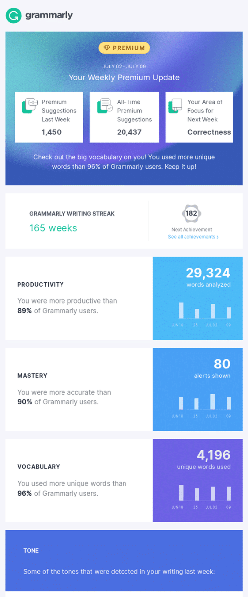
Source: Really Good Emails
Put the Most Important Thing First
The infographic may include a lot of data, but not all have the same weight or interest for the user. Always start with what they may be expecting to receive, and then add the rest. This way, even if they don't read the complete message, they'll take away the main image that you also want them to know.

Source: Really Good Emails
Tell a Story
To ensure they read the entire email, explain the segmented data. Unveil them gradually, like chapters in a story. These blocks will also aid understanding and make reading the message easier. This example, moreover, is done with a style and tone very characteristic of the brand.

Source: Really Good Emails
Maintain Your Style
You may tweak your usual template a bit to accommodate the infographic, but you shouldn't lose your identity. Both in the email where you send it and in its design, include the visual references that will make it identifiable as yours.

Source: Really Good Emails
Don't Leave Anything Out
There are infographics that could be pages from a diary because they include everything the user would need to know to start the day, week, or month, depending on how often they are sent. Keep in mind that when infographics are very long, it's better to break them into different blocks so that the image doesn't take too long to load.

Source: Really Good Emails
Add a Clear Caption
Whether it's to explain user data, community averages, or a comparison with their goal, make sure they are easily understood. That's what infographics are for—to explain complex data. If they are hard to interpret, they cease to fulfill their function and lose interest.


