
For a campaign to be accessible, you need to take care of both the design and the text. Of course, it is essential that there is a good contrast of colours or that the typography is at a good size so that it reads well, but it is also essential that the content is understandable and compatible with screen readers. An accessible copy makes our message readable by as many people as possible, which increases the likelihood of conversion.
What is an accessible copy?
A copy is a persuasive text used in advertising campaigns, including email marketing campaigns, to get the user to perform the desired action. By applying the principles of accessibility, we manage to improve the experience of all users, thinking about people with a vision problem as well as the different educational levels. An accessible copy removes barriers; it is inclusive and effective because it is clear and understandable.
To know if a text is accessible, a readability test such as the Flesh-Kincaid test can be applied to it to measure its readability. This mathematical formula varies from language to language, but always takes into account the total number of sentences, words and syllables. The higher the result, the easier to understand and therefore the higher the click-through rate and the fewer unsubscribes because subscribers will have more confidence in the content.
Best practices for writing accessible copy
The World Wide Web Consortium (W3C) is the body responsible for developing accessibility standards, in addition to HTML and CSS. According to its writing recommendations, the accessible copy of an email marketing campaign should be:
- Direct: get to the point so that it is not a great effort to read the whole campaign. Use the active voice in the construction of your sentences and simple words so that there are no doubts or having to read twice to understand them. They will also be shorter.
- Simple: if we listen to readability tests, sentences and words should be short so that they are easier to read. Reread the text and cut sentences in two so that they do not take up more than a couple of lines and replace longer words with synonyms that have fewer syllables.
- No slang: it may be tempting to use slang, but it is only advisable when you can be sure that all recipients will understand it. Plain text is the best option to reach any type of audience, even when it is a very technical sector. For example, some generations like to play with upper and lower case when writing, but for others it may seem a serious mistake.
- Informative: this is used throughout the message, but especially in the subject line, which would be equivalent to the title of the page, and in the links, including calls to action, so that there is no doubt as to where the user is going to go when they open the message or click on it.
- Descriptive: include the necessary explanations to ensure that the message is clear. This includes instructions in transactional messages as well as abbreviations, initialisms or acronyms, including limiting the use of English words that may sound too specialised without a translation or description.
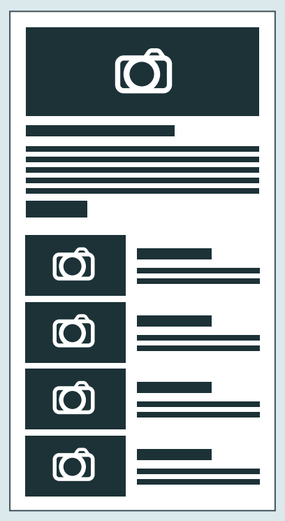
- Structured: to support the visual hierarchy of the design for readability, content needs to be broken down into sections with subheadings to facilitate a quick understanding of what is included in each section, also with lists or bullets, for when you scan the screen to find what you are interested in reading.
Design and text complement each other, so illustrations, infographics or icons can be used to help explain processes that are better understood visually, as well as emojis that do not have different meanings. And always bearing in mind users who do not have their images unlocked or those who rely on alternative texts for their screen reader to interpret them.
Finally, accessible copy is adapted to all audiences, but can still be customised and localised for different audiences, especially if they are international, so as to minimise errors caused by mistranslations or cultural differences.


